Flutter ABCs: The Pursuit Of Responsiveness
Some helpful pointers to help a beginner build responsive apps and tackle sizing and positioning.


Responsiveness- the ability of an app to look good on all devices, irrespective of size- has got to be one of the most elusive and tricky things in a front-end dev's list. It's hard to get right and can be extremely frustrating to achieve as a newbie.
And yet, we can't do without it. If an app doesn't render beautifully on all devices, it doesn't matter how well you've designed all the other aspects. Besides, what's the point of using a cross-platform SDK like Flutter when you don't deliver a great experience to users with different devices?
So this article attempts to give a few helpful pointers on dynamic sizing and building responsive components using Flutter.
1. Keep it simple with the Golden Rule
"Sometimes, the best thing to do is to do nothing"
And by 'doing nothing', I mean not specifying width or height explicitly. Many a time, you'll find that your component fits the parent perfectly, just as you wanted it to.
But I definitely wouldn't advise you to throw this trick around at random; in order to use this effectively, and wield real power, you need to understand what some call the Golden Rule of Flutter Layouts.
To put it simply, this is how a widget is rendered on the screen:-
- Widget asks its parent what its constraints are.
- Widget then goes through its own list of children, letting them know their constraints, then asking them what size they want to be. Now, widget can position its children.
- Finally, widget tells its parent what size it wants to be.
(Pay special attention to the precedence!)
That's it. It might not look like much when I put it this way, but the next time you find that some layout instructions aren't being obeyed, go over this in your head, and more often than not you shall have the reason why.
(I've summarized it here, but if you'd like to do a deep dive, I highly recommend 'The Advanced Layout Rule' by Marcelo Glasberg - this is the article that introduced me to the concept and was so good Flutter decided to publish it! )
2. Helpful widgets: some must-knows
More often than not, as a Flutter beginner, I was surprised to see that there was a very simple solution to a problem that I was breaking my head over.
Expanded
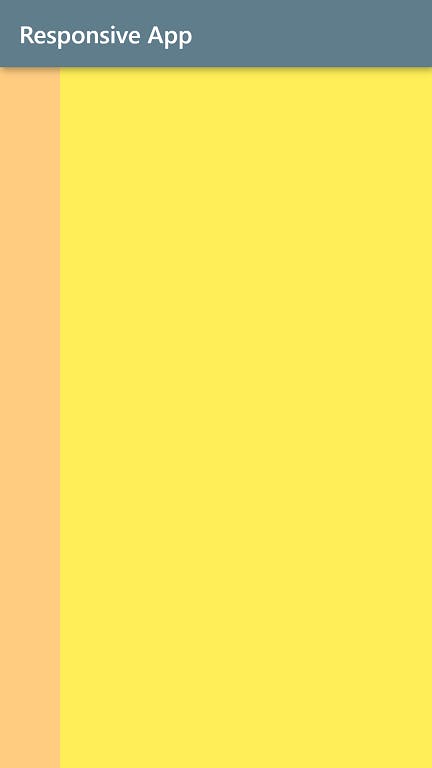
A super simple widget to use, wrap the child of a Row or Column with Expanded to make it occupy the entire space available to it in its axis.
Container(
        height: double.infinity,
        child: Row(
          children: <Widget>[
            Container(
              width: 50,
              color: Colors.orange[200],
            ),
            Expanded(
              child: Container(
                color: Colors.yellow[400],
              ),
            ),
          ],
        ),
      ),
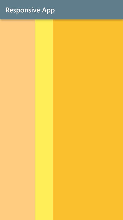
Flexible
The most obvious parallel to flex in css. A useful tool to size children relative to their parent. Wrap each of your Row/Column's children in a Flexible widget, and specify a flex value (the ratio of the parent) for each.
Container(
        height: double.infinity,
        child: Row(
          children: <Widget>[
            Flexible(
              flex: 2,
              child: Container(
                color: Colors.orange[200],
              ),
            ),
            Flexible(
              flex: 1,
              child: Container(
                color: Colors.yellow[400],
              ),
            ),
            Flexible(
              flex: 4,
              child: Container(
                color: Colors.yellow[700],
              ),
            ),
          ],
        ),
      ),
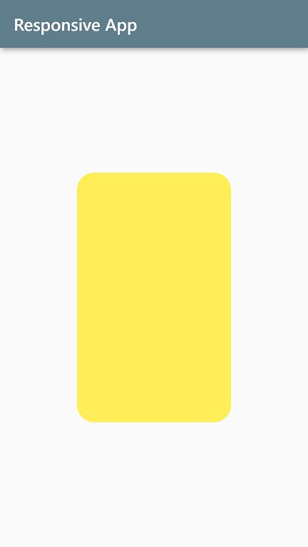
FractionallySizedBox
In CSS, a common way to perform relative sizing is to use percentages. FractionallySizedBox is the perfect fit for that role in Flutter. Want a child to occupy 50% of its parent's width? Wrap it in a FractionallySizedBox and set widthFactor to 0.5.
Center( //parent
        child: FractionallySizedBox(
          widthFactor: 0.5,
          heightFactor: 0.5,
          child: Container( //child to be sized
            padding: EdgeInsets.all(10),
            decoration: BoxDecoration(
                color: Colors.yellow[400],
                borderRadius: BorderRadius.all(Radius.circular(20))),
          ),
        ),
      ),
3. MediaQuery
Besides Flexible and FractionallySizedBox, there's yet another way to relatively size components- MediaQuery. It's a way for us to specify the percentage of the screen size.
double width = MediaQuery.of(context).size.width;
'width' can then be used to set widget sizes like so:-
Container(
     width: width*0.5;  //50% of screen width
),
Double.infinity
You must've seen this used in the code snippets above. It's used when you want your widget to be as big as its parent (unlike MediaQuery, which specifies the size of the entire screen).
4. Constraints as a secret weapon
Does that component look a little too small on the web, and large on the mobile? Fractional sizing is a good choice, but don't forget that it can be combined with constraints. Pretty obvious, really, but the reason I say 'secret' is because we often don't leverage its full capabilities.
Center(
        child: Container(
          width: MediaQuery.of(context).size.width * 0.7,
          height: 200,
          constraints: BoxConstraints(maxWidth: 400),
          decoration: BoxDecoration(
              color: Colors.yellow[400],
              borderRadius: BorderRadius.all(Radius.circular(20))),
        ),
      ),
Now, observe that the yellow box doesn't look too large on a wide device like a Nest Hub, even though it's been asked to occupy 70% of the screen width (to fit regular mobile screens such as a Galaxy S5).
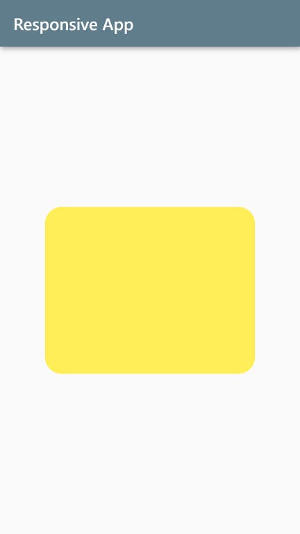 Screenshot above from Galaxy S5
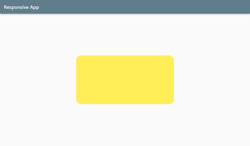 Screenshot above from Nest Hub
A ceveat
Sometimes, in cases such as this, you will find that the constraints specified are not respected. Why? Because in addition to those imposed explicitly by you, there are those imposed by the parent, and the latter is complied with first. Always remember the Golden Rule!
5. Previews
Last, but not least, absolutely essential to your quest for responsive apps is a good debugging tool. Being able to view your app in different aspect ratios is a necessity, and you might be surprised by how easily you can do that in Flutter. Read this article by my friend and fellow developer. (Spoiler: it's all about Flutter Web ;) )
Thanks for reading, and good luck with your Flutter projects!