A UX concepts starter pack
A quick peek into a few popular UX terminologies and principles

I'm a comp sci student and developer. I love thinking up unique solutions and designing them as much as I love coding them up! And of course, you guessed it- I enjoy writing :)
As a developer, I came across lots of design terminologies that always intrigued me, but it wasn't until I did a deep dive into some of them that I truly came to appreciate the concepts and complexities involved. So here's a compilation of some terms and principles that you should probably know as a frontend developer, even if not an aspiring designer.
For each principle, I've also tried to include some actionable advice I've picked up from various sources; a quick takeaway.
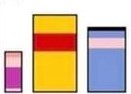
Negative space, positive space
Simply put, positive space is what is in the foreground- the main element to which you want to direct your user's attention. Negative space comprises the background: the canvas on which your main element rests.
A lot of design articles highlight the importance of negative space, and for good reason. It's important to space, color, and position your element appropriately, in tandem with its surroundings.
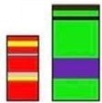
Negative space can, in fact, be used very cleverly to convey meaning, and here's an example of how it has been exploited for the best results.

As you can see for yourself, there is no positive space without negative space, and vice-versa.
Takeaway: Space your elements well- this can never be said enough. Ensure good contrast. For example, the user should be able to distinguish between a button and its unclickable surroundings at a glance.
Color psychology
This one's fairly straightforward. Color psychology, as you can guess, is about how colors influence the human mind and make the end-user perceive your product. Do you want your product to have a mysterious vibe? Denote simplicity? Colors play a very important role in 'landing the right look'. Check out Canva's tool to get a deeper insight.
But there's another crucial part played by colors in your website or app: it characterizes your brand. When effectively done, it ensures that, over time, users associate particular colors and themes with your brand.
Can you guess the Disney characters below?
Or maybe these superheroes?
If you can guess, it's because of the consistent color palettes. Good job, Disney and Marvel. (Yes, it's Winnie the Pooh, Piglet, and Eeyore in the first and Iron Man and Hulk in the second. )
Takeaway: Not all colors suit all products. Think, choose an appropriate palette, and stick to it. Here's a simple example- a dark theme is not always a good idea. It has been known to work great when it comes to giving a dramatic, enigmatic vibe, or when your target is a younger user base. Applying it to a heavy-use business dashboard, for example, is not preferable.
Contrasts and readability
A question a lot of us have is: how good does this text look against this background color? And it's a good question too. This is an important aspect to consider, not just in view of aesthetics, but also readability. Here is a tool to quickly check readability and compliance with WCAG standards.
But beware, high contrast does not always equal high readability. Sure, contrast shouldn't be too low, but it mustn't be too high either, else it'll be too jarring.
It doesn't end here
This bite-sized article introduced you to a few design principles, mostly centred around coloring. As you can imagine, there's plenty more to explore. In fact, I'm learning, and working on a part-II of this article, and I hope to see you there!


